Palette
A restrained palette applied with intention, avoiding decorative excess.
Music · Culture · Visual System
A dense, urban and editorial visual language.
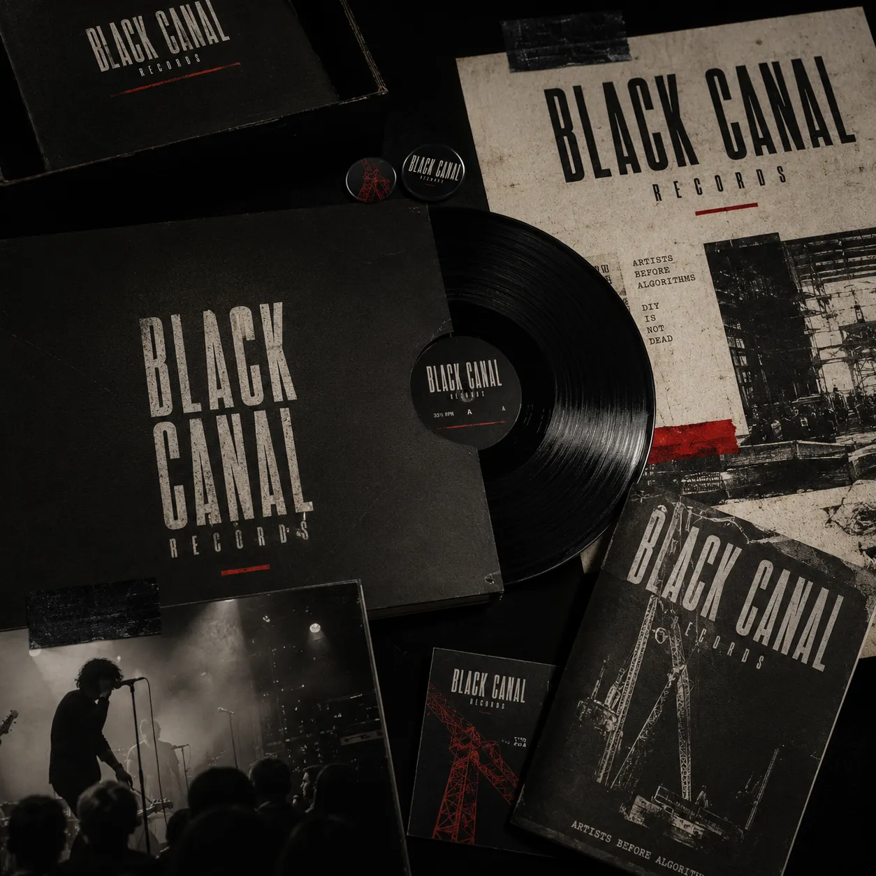
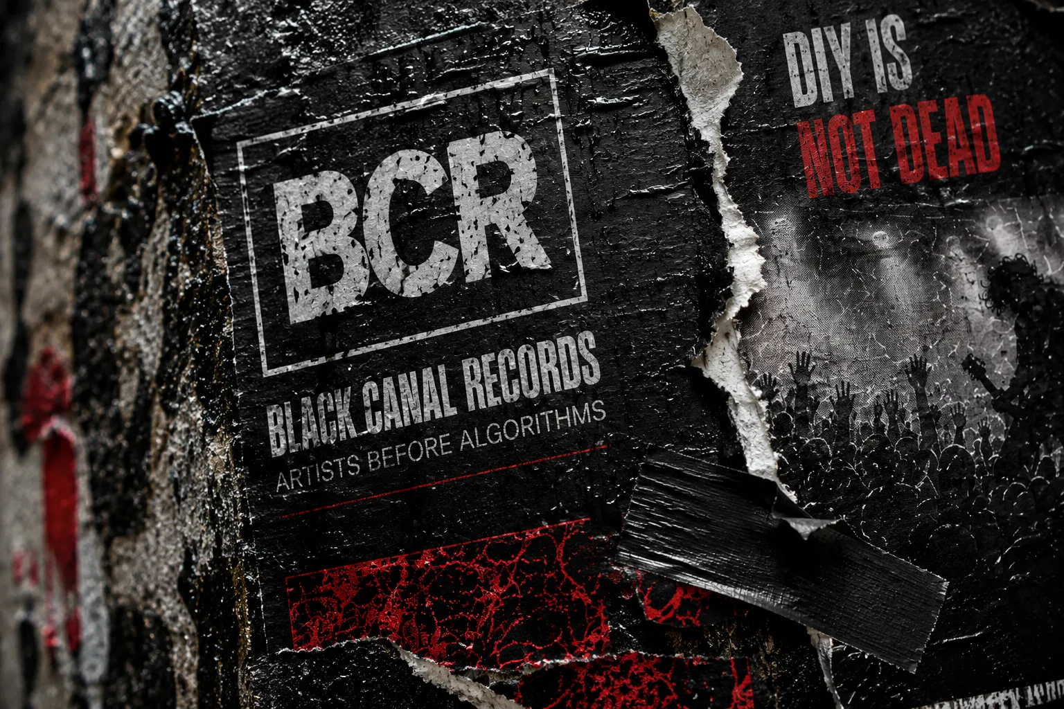
A visual system for an independent music label, focused on atmosphere, texture, contrast and coherence across physical and digital touchpoints.
01
Challenge
The project needed a strong visual identity that could carry the weight of an independent label without becoming rigid or repetitive.
Intention
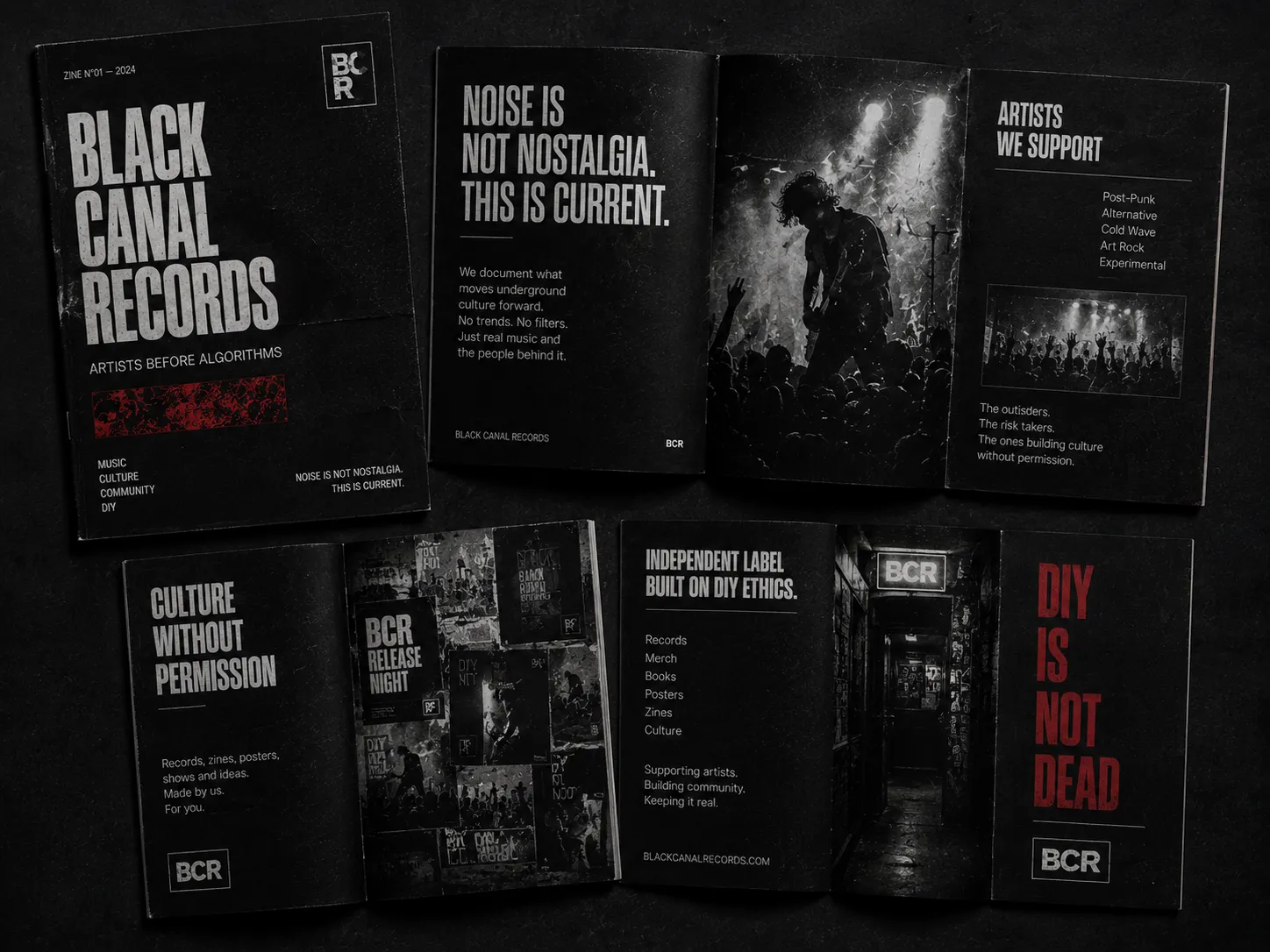
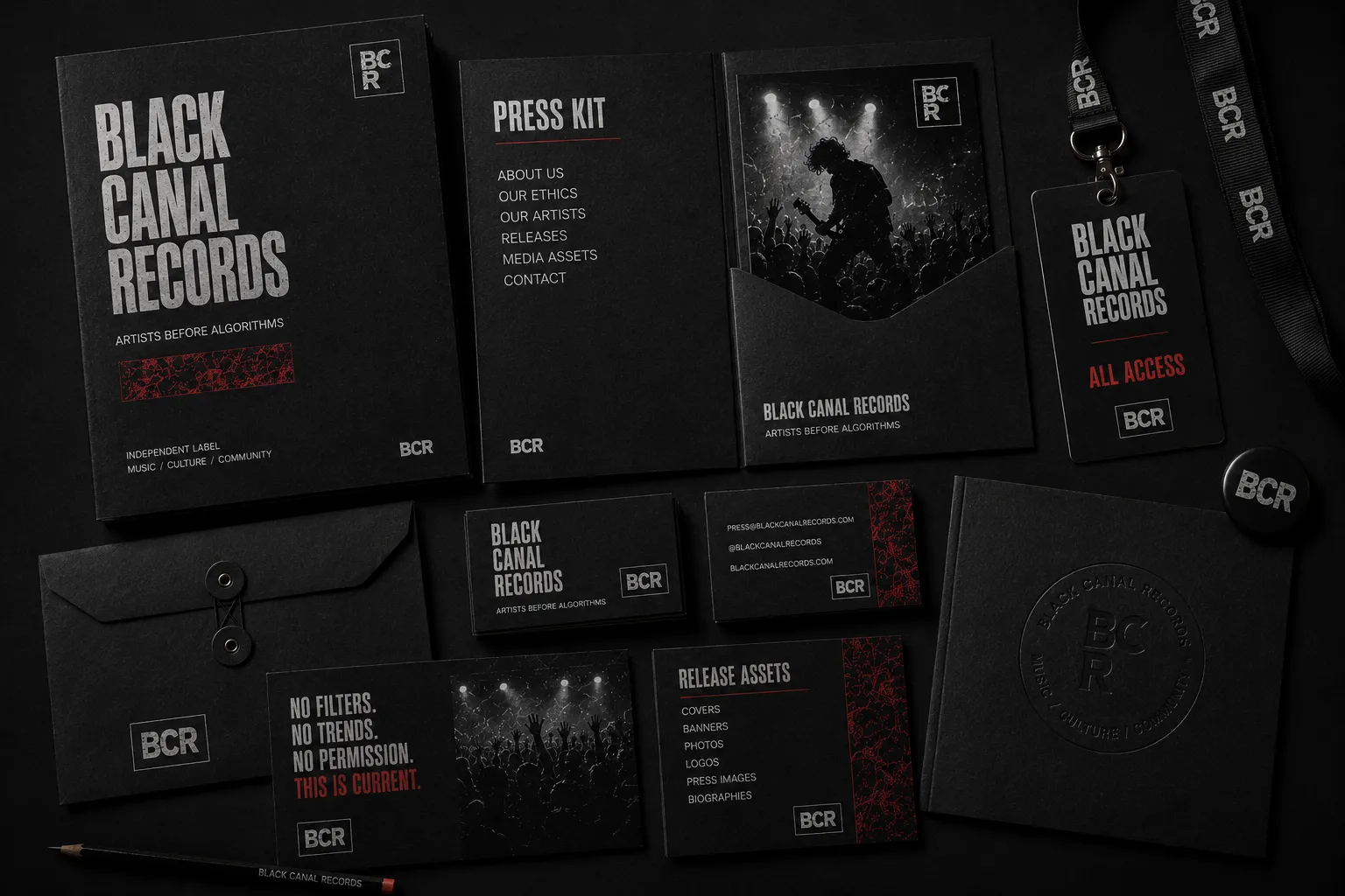
The intention was to create a visual system with rhythm, contrast and texture, flexible enough for releases, posters, digital pieces and editorial formats.

02



03
A restrained palette applied with intention, avoiding decorative excess.
Clear hierarchy, strong titles and simple reading across every format.
A visual element treated as part of a system, not as an isolated mark.
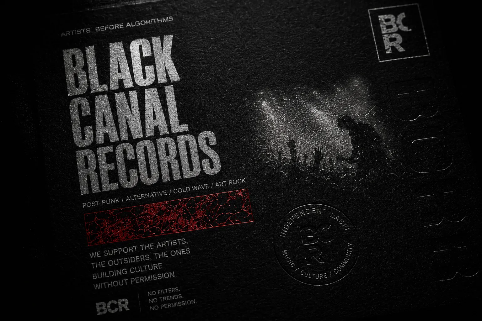
Subtle details that create atmosphere without compromising clarity.
Controlled repetition to create continuity and recognition.
Images with space, contrast and editorial coherence.
04

05
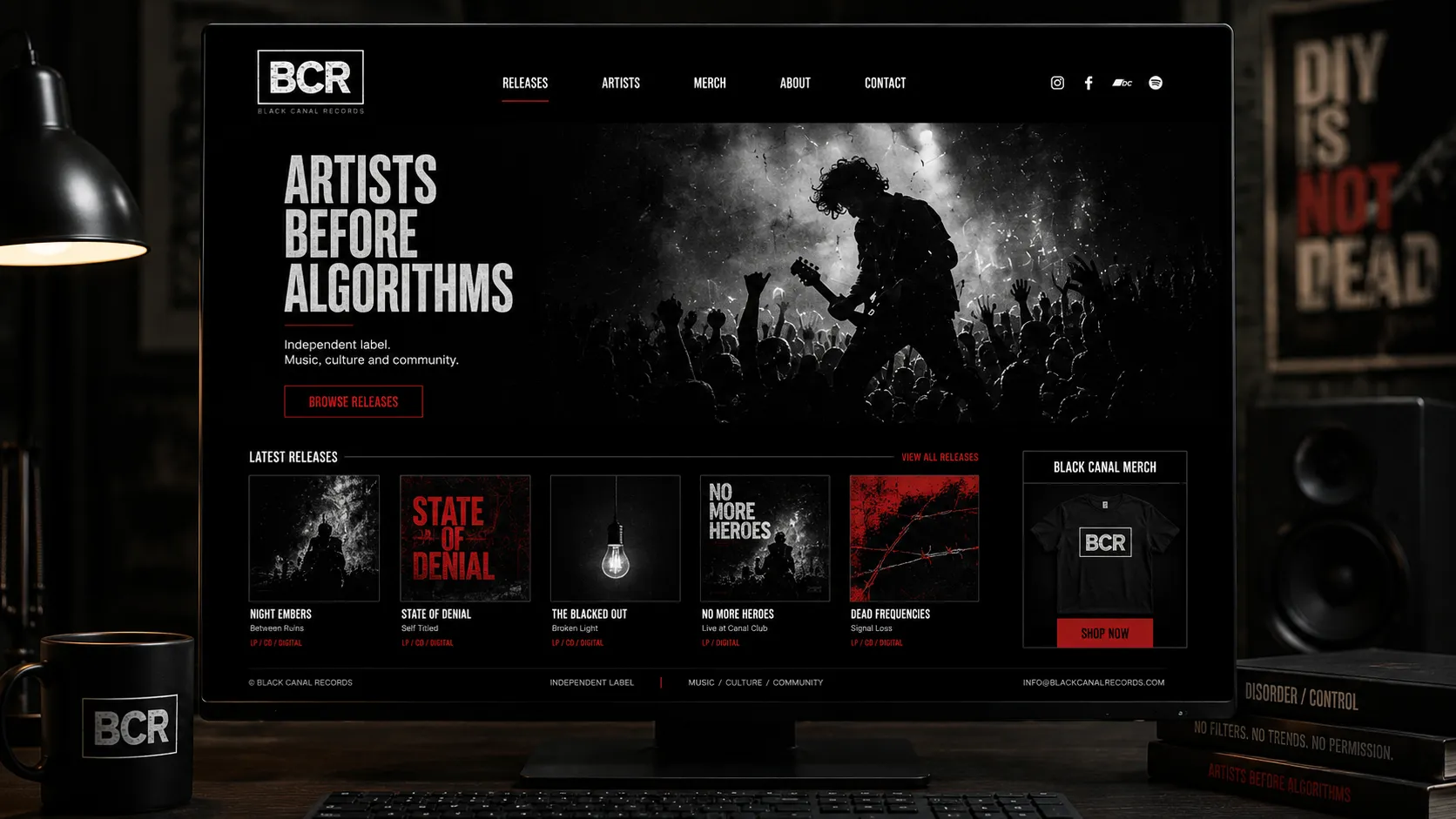
The digital applications translate the visual system into responsive brand touchpoints, from website presence to mobile and social media formats.


06
The result is a visually denser brand system, able to support different formats without losing identity or attitude.

Share the context and I will reply with objective next steps to structure identity, direction and digital presence.